Eaux Claires IV

Another year of the Eaux Claires Music Festival, another year of experiments. We channeled our inner rebels to attempt support a bold new approach to a festival: no lineup announcements before the festival. We worked intimately with the Eaux Claires team Michael Brown, Michael Perry, Justin Vernon, Aaron Dessner, and Mary Hickson to support this bold new idea with branding, marketing, installations, merch, and environmental design. IV was an attempt to change the idea of a festival to something less concrete and sometime more fluid.

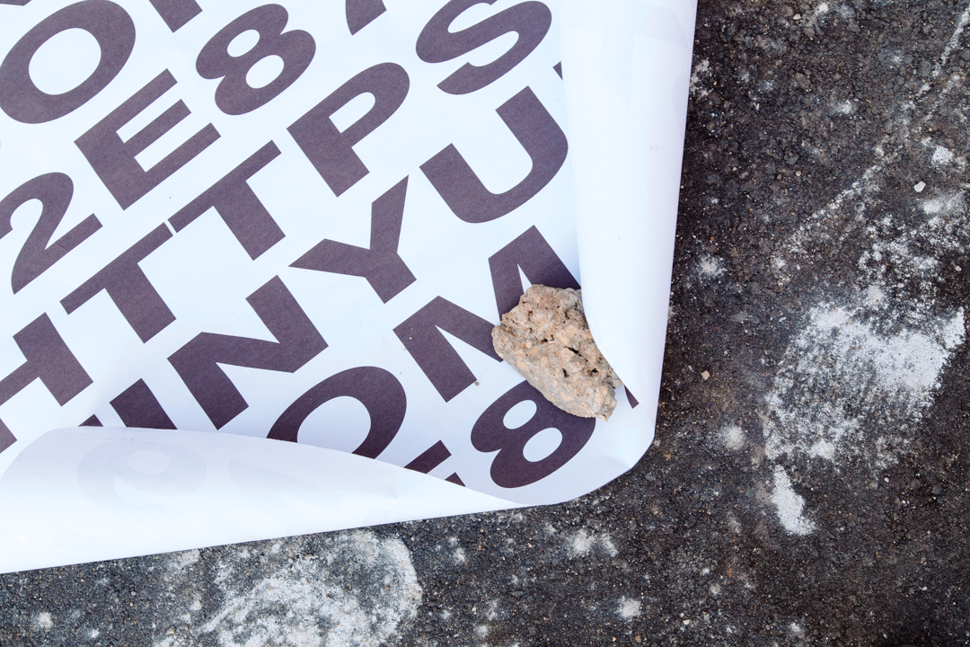


We started in November — T-minus 8 months to the fest — with a guerrilla-style marketing campaign focused hyper-locally, right in the city of Eau Claire. Our visual language utilized collage and lo-fi distortion; embracing the tangible feeling of existing in real life, the messiness and imperfections of it. We would go on to push the boundaries of this language as we explored the deconstruction of the festival.
We designed and installed a 27’ wide wheatepaste in downtown Eau Claire, where we knew it would be seen and inspected. We went live on Instagram to make sure the rest of the world knew. The two-part wheatepaste release advertised an Eaux Claires podcast, teasing specific artists and creating some mystery around what was to come. The next day, we released the dates of IV on a second layer of wheatepaste, playing on hype, the importance of time and place, and impermanence.
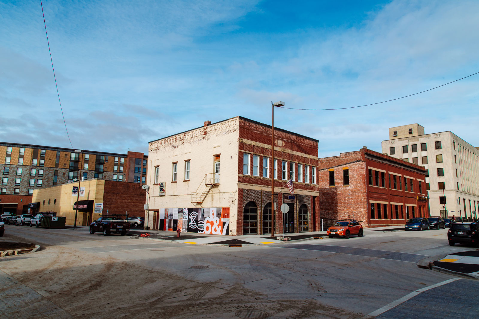

Photos Christopher Bartlett
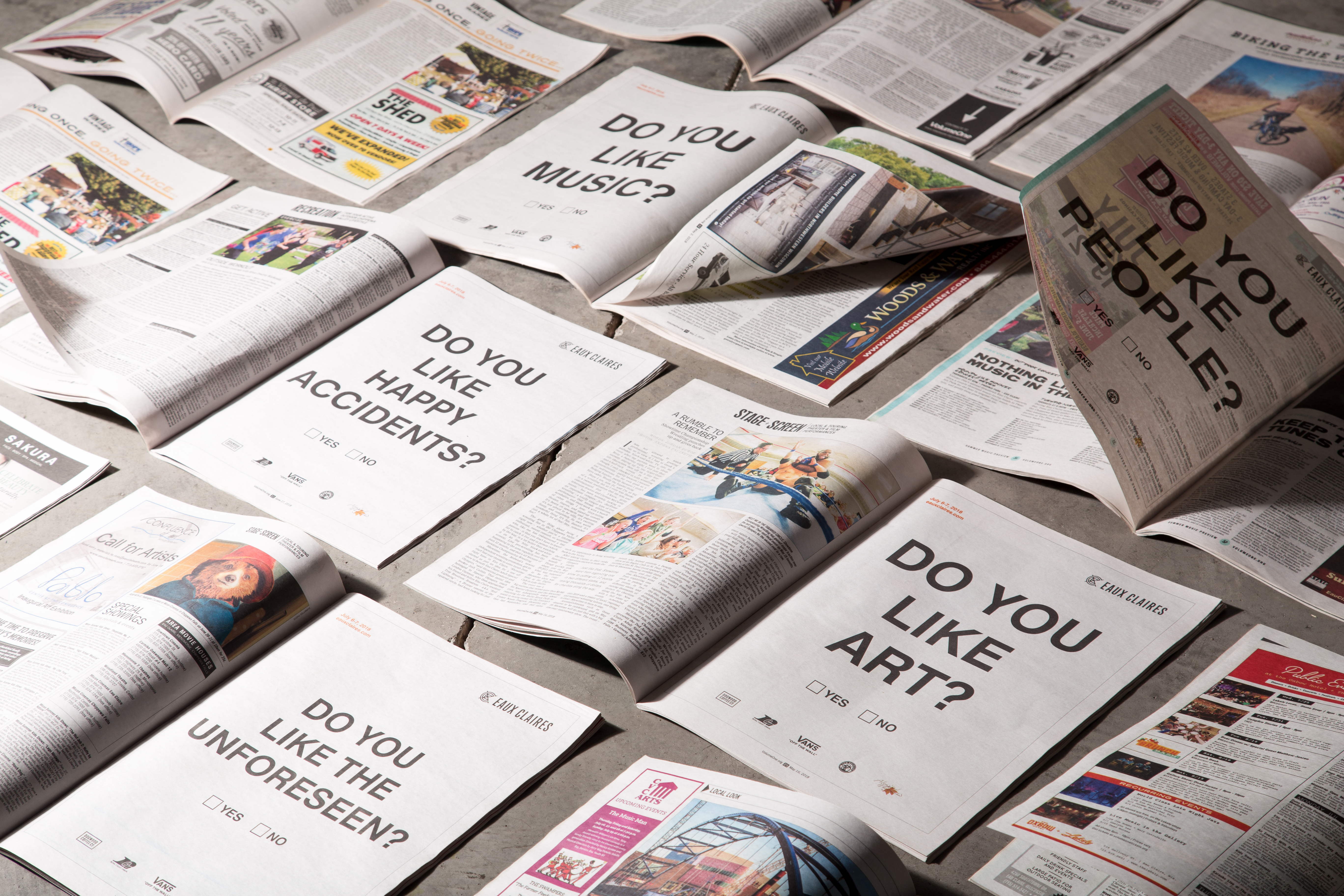
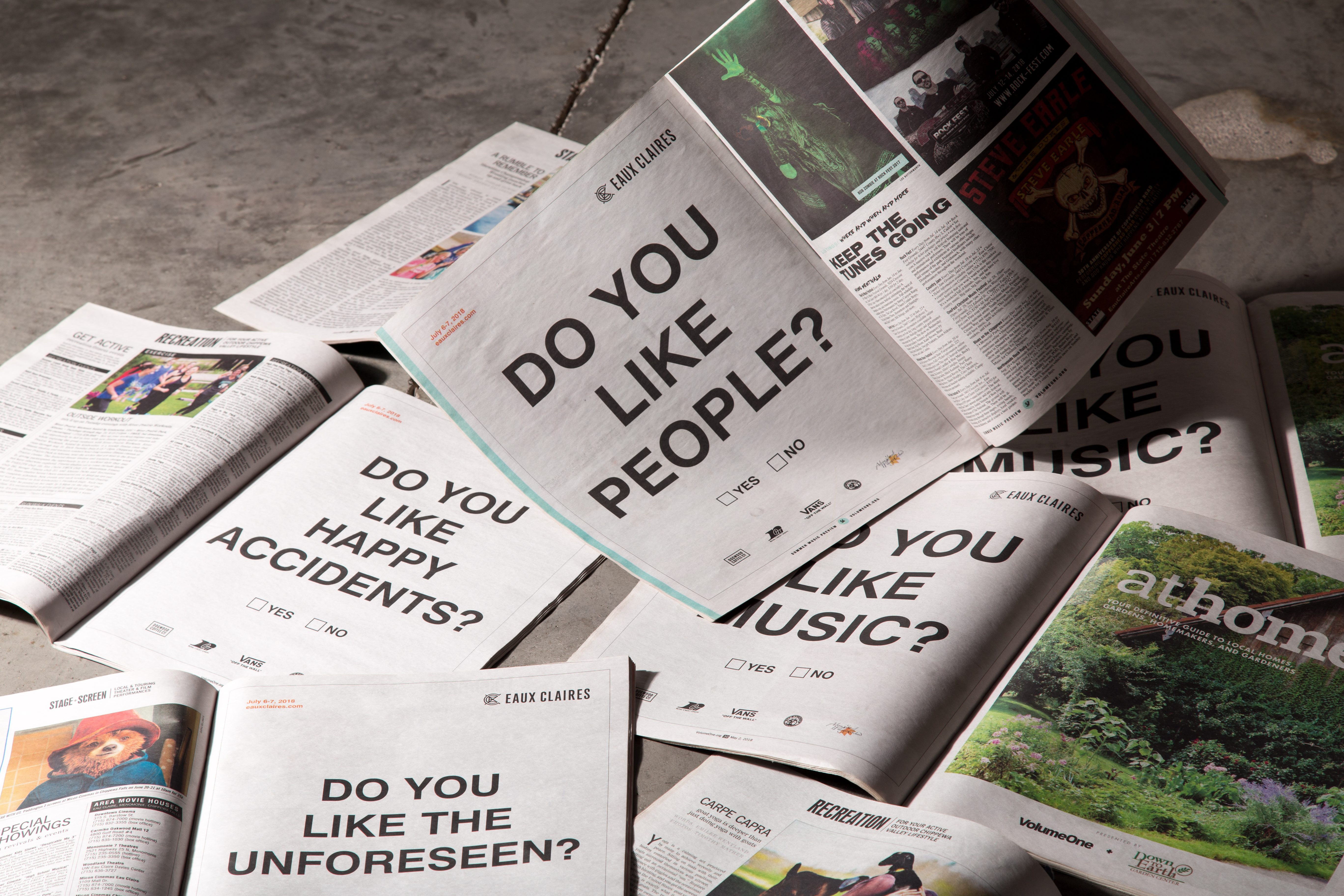
While marketing for festivals usually lives online, the shift of IV was to embrace the tangible, the IRL experiences — in its most literal sense. Marketing pushes were organic, designed to create a buzz, and mostly traveled by word of mouth within the community. We made it a point to utilize physical marketing opportunities, like taking out full page ads in Volume One, the Chippewa Valley local weekly.
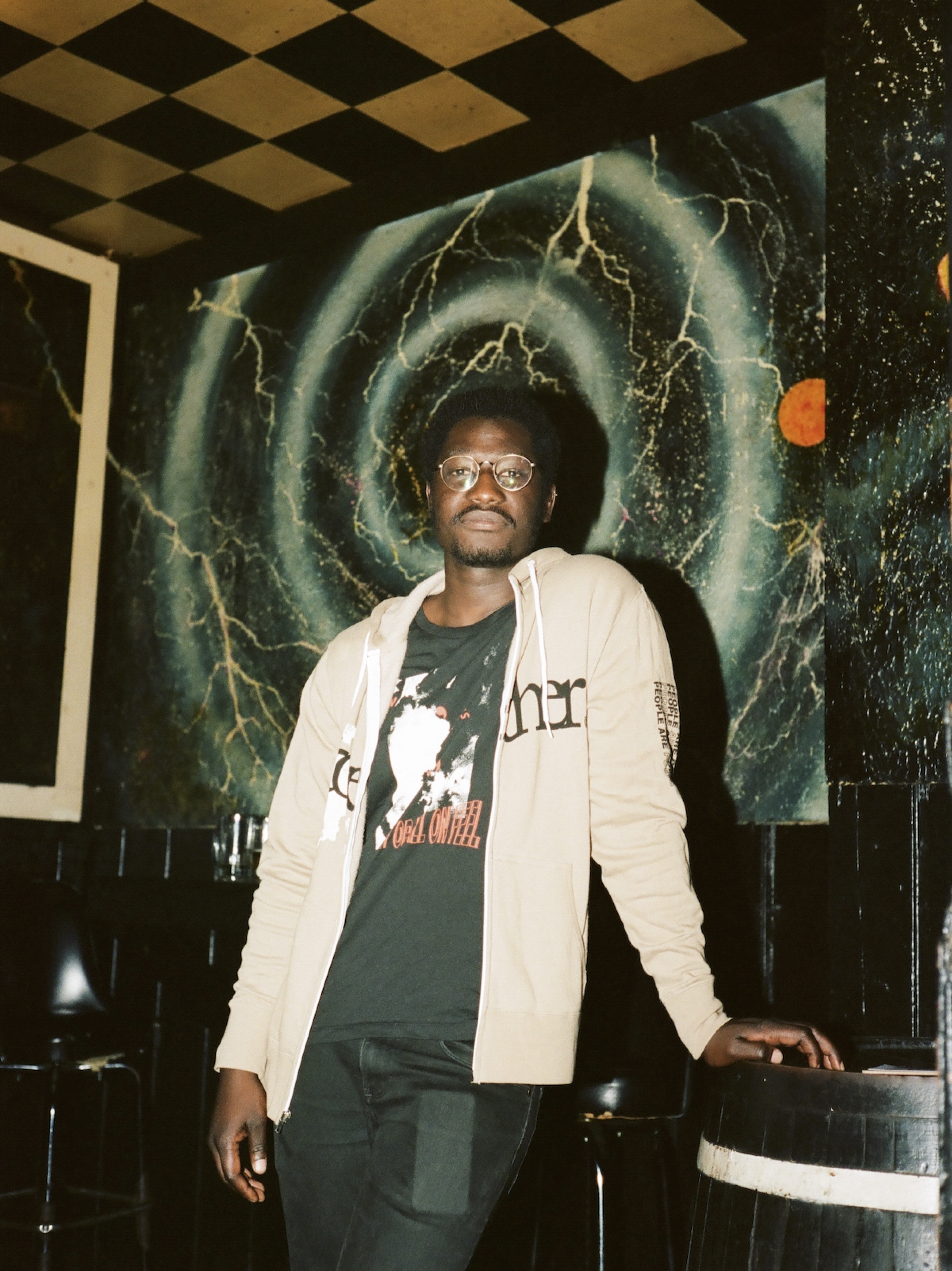
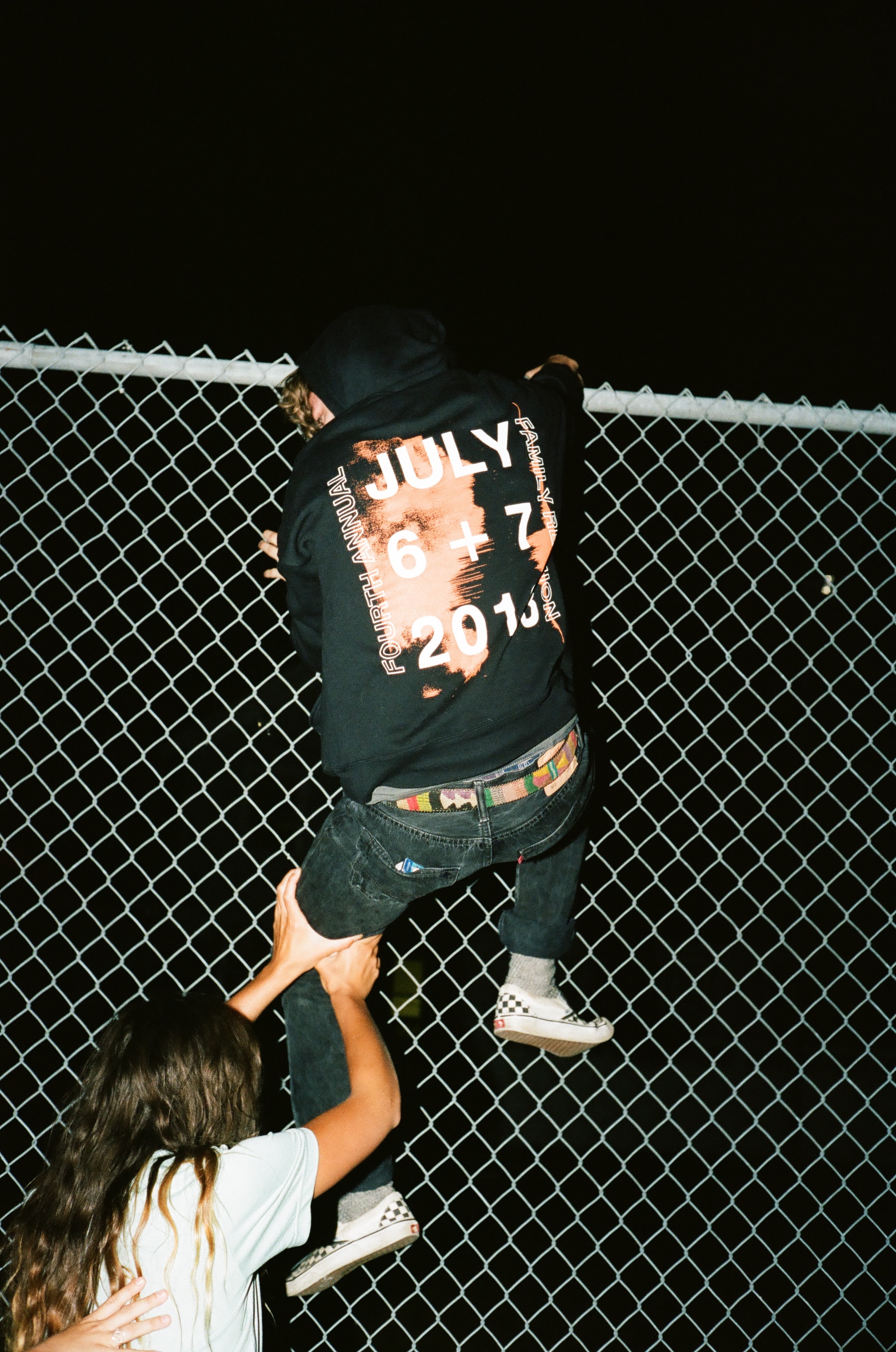
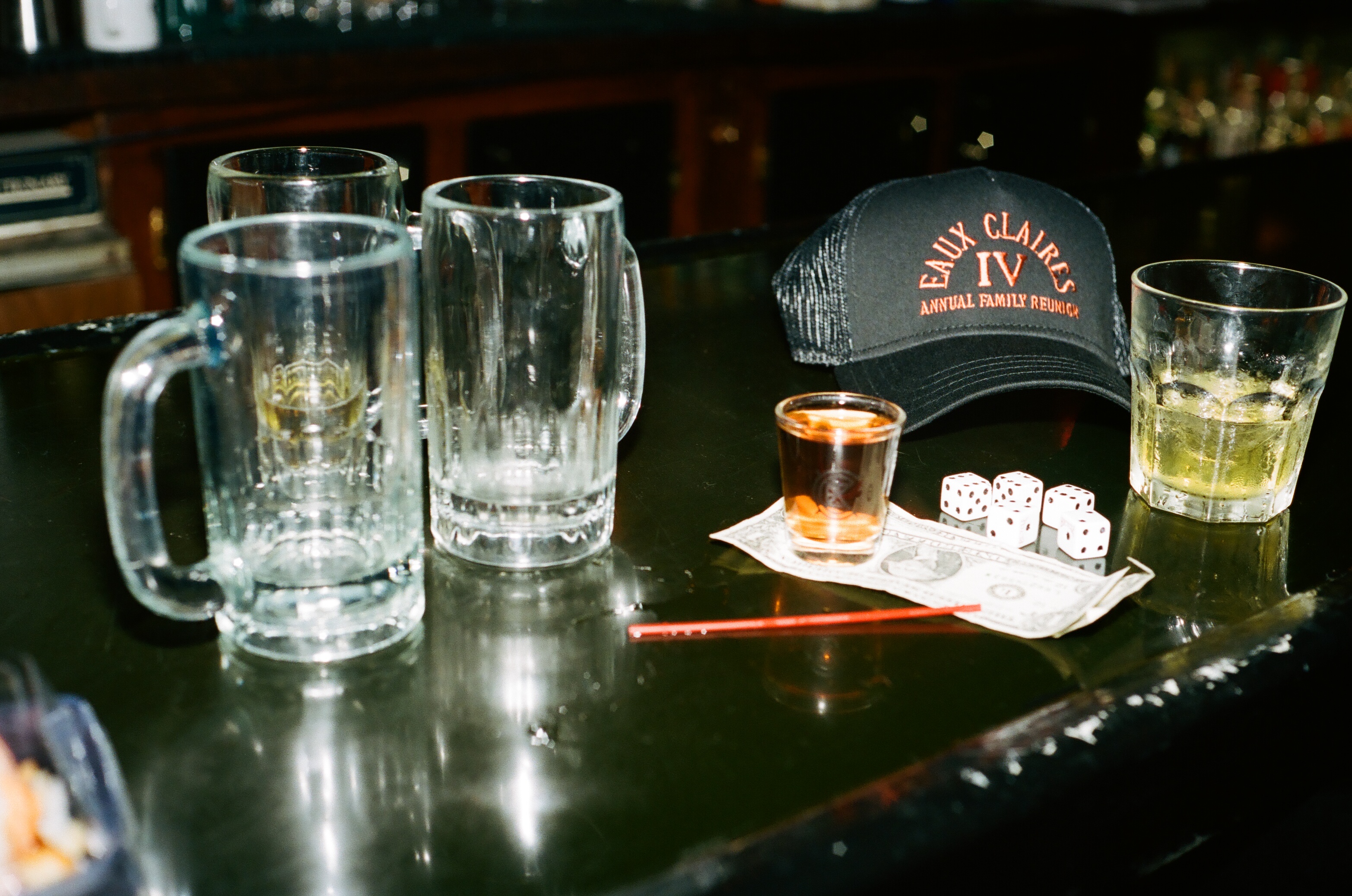
The merch for IV — proudly printed locally by Knorth’s sister company, Ambient Inks — is designer’s dream each year. Our team always manages to have a blast creating and capturing the merch. We extended IV’s visual language of collage and lo-fi, tangible textures and extended that to more unexpected content. We pulled quotes from the Eaux Claires podcast and always-introspective musings of festival narrator, Michael Perry to use text as a texture in the pieces.
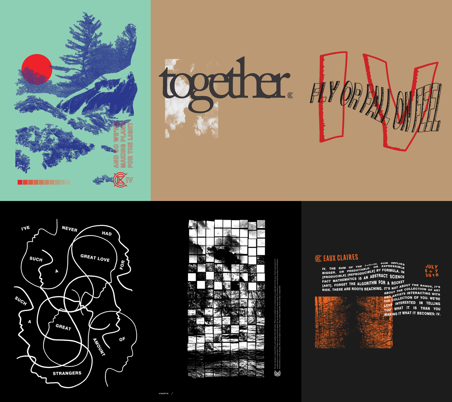




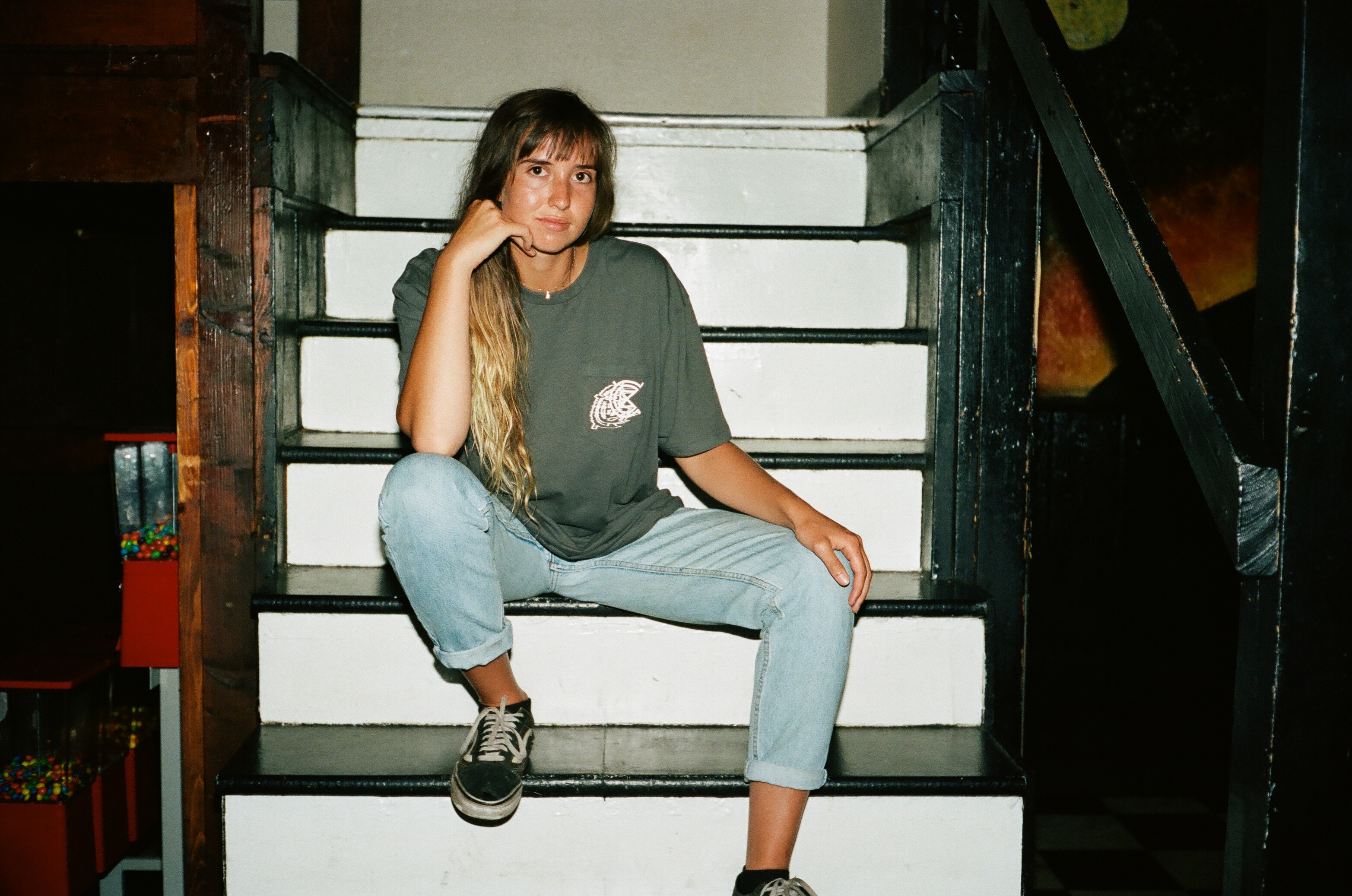

Other than our branding duties for IV, we had a special opportunity this year to really get hands-on with the festival grounds. We designed signage, badges, credentials, and a Field Guide-style program for the festival.
We had the pleasure of designing and installing a full wheatepasted design over Ben Krall’s beautiful structure on the House of Vans and stage. We covered the stage 100% utilizing collage, texture, and distortion to bring the IV brand to life on the grounds. We couldn’t be more proud of how it turned out, with all the hard work that went into it.

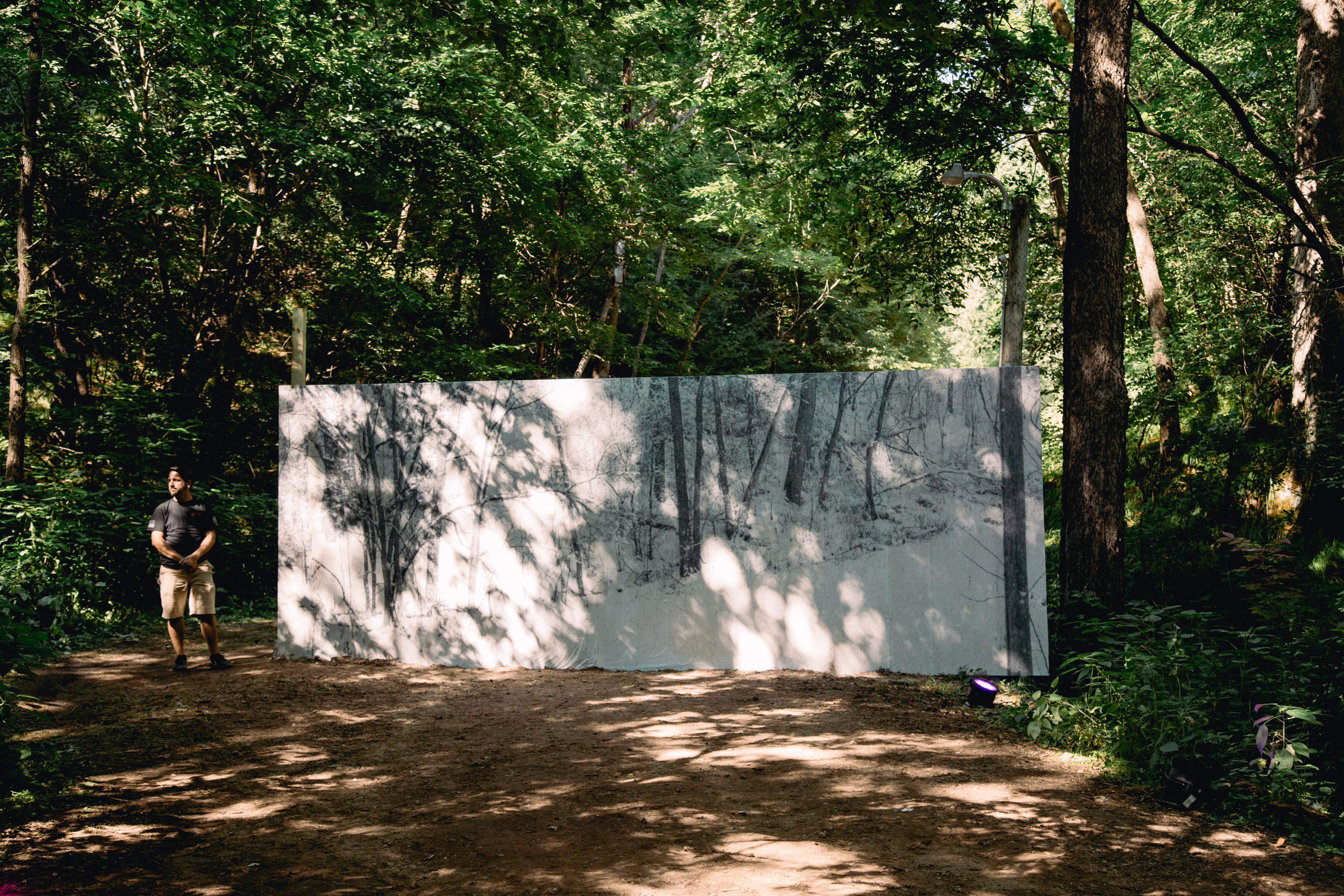
In addition to the House of Vans stage, we installed 2 art pieces on the grounds. Entitled “Winter is Here”, these walls are windows into wintertime on the festival grounds. We wanted it to feel like you could keep walking right through that portals into the winter.
The smaller of the two walls actually included a functional door in the middle of the piece. At certain times, festival goers could sneak through and attend an unofficial dance party on the edge of the grounds. ︎

Credits
Photos: Christopher Bartlett & Nate Vrieze
Videos: Christopher Bartlett & Scott Kunkel
Videos: Christopher Bartlett & Scott Kunkel
Merch Shoot
AD: RT Vrieze & Ann Kennedy
Merch Design: Ann Kennedy, RT Vrieze, Daniel Wagner, & Joe Boettcher
Photos: Nate Vrieze
Models: Bex Morton, Anthony Clementi, Sheikh Jammeh, & Libby Andrego
AD: RT Vrieze & Ann Kennedy
Merch Design: Ann Kennedy, RT Vrieze, Daniel Wagner, & Joe Boettcher
Photos: Nate Vrieze
Models: Bex Morton, Anthony Clementi, Sheikh Jammeh, & Libby Andrego
